Meetup 2: Visualizing Data

George I. Hagstrom

2025-09-01

Week Summary


1. Read Chapters 1-4 of R4DS (Work out the problems as you go!)

2. Supplementary Readings- Data Viz 1-5 (Wilke), Calling BS (West and Bergstrom) Proportional Ink and Misleading Axes

3. Lab 1: Airbnb in NYC- submit qmd file and pdf on Brightspace by Sunday Midnight

4. Data Science in Context- sign up if you haven’t yet

5. If you don’t have a working software setup speak up in Slack!!!

Why Make Graphs?

  • Graphs are the main way we communicate data
  • Alternative would be summary statistics, but visualizations are much richer.
  • Big debate within statistics community because summary stats perceived as more “rigorous”
  • Graphs won the debate- they are the main and most important thing people will remember about your data analyses

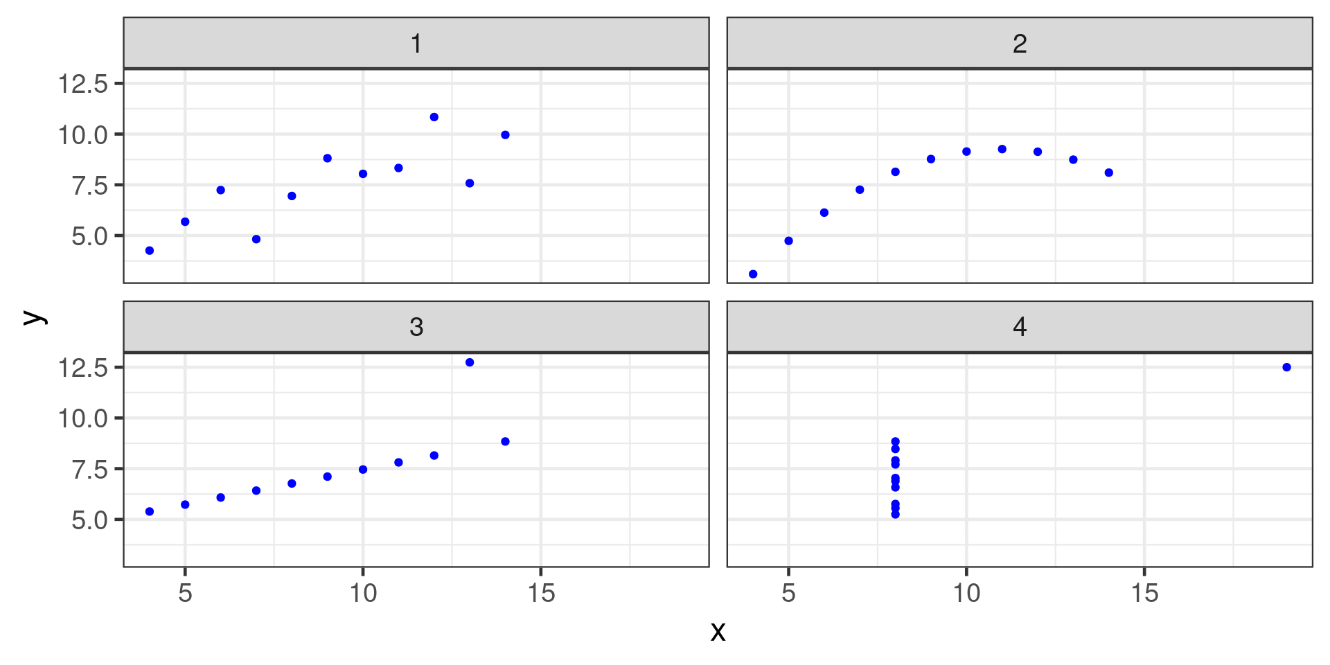
Anscombe’s Quartet

Set 1:

x y
10 8.04
8 6.95
13 7.58
9 8.81
11 8.33
14 9.96
6 7.24
4 4.26
12 10.84
7 4.82
5 5.68

Set 2:

x y
10 9.14
8 8.14
13 8.74
9 8.77
11 9.26
14 8.10
6 6.13
4 3.10
12 9.13
7 7.26
5 4.74

Set 3:

x y
10 7.46
8 6.77
13 12.74
9 7.11
11 7.81
14 8.84
6 6.08
4 5.39
12 8.15
7 6.42
5 5.73

Set 4:

x y
8 6.58
8 5.76
8 7.71
8 8.84
8 8.47
8 7.04
8 5.25
19 12.50
8 5.56
8 7.91
8 6.89

Anscombe Summary Stats:

Set mean(x) mean(y) sd(x) sd(y) cor(x,y)
1 9 7.500909 3.316625 2.031568 0.8164205
2 9 7.500909 3.316625 2.031657 0.8162365
3 9 7.500000 3.316625 2.030424 0.8162867
4 9 7.500909 3.316625 2.030578 0.8165214

Are the datasets the basically the same?

Anscombe Visualized:

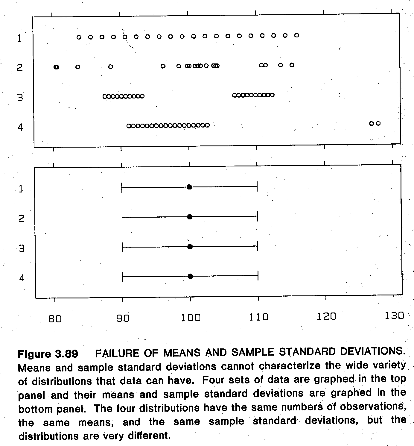
1D Example

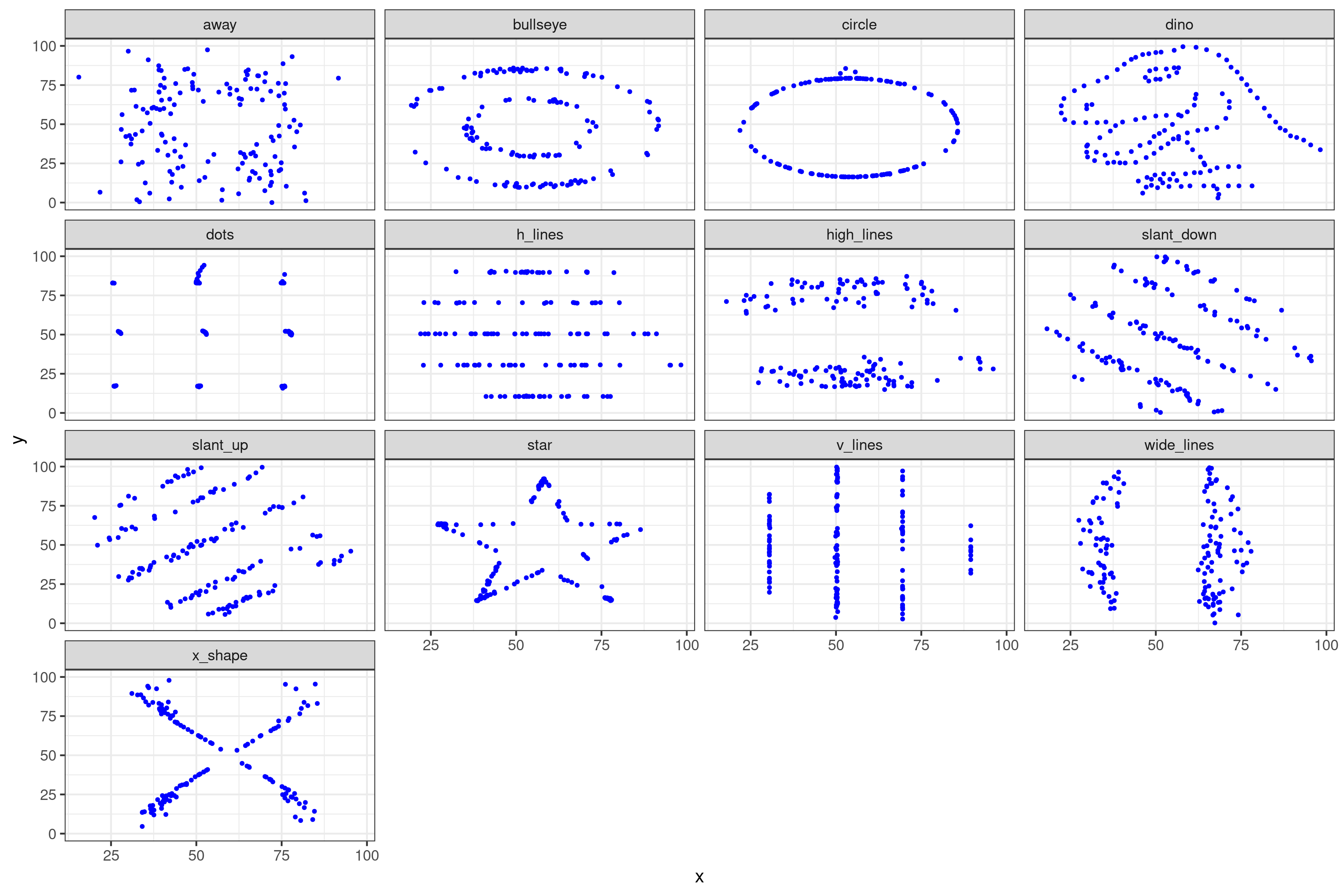
Datasaurus Dozen
Non-Contrived Example
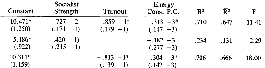
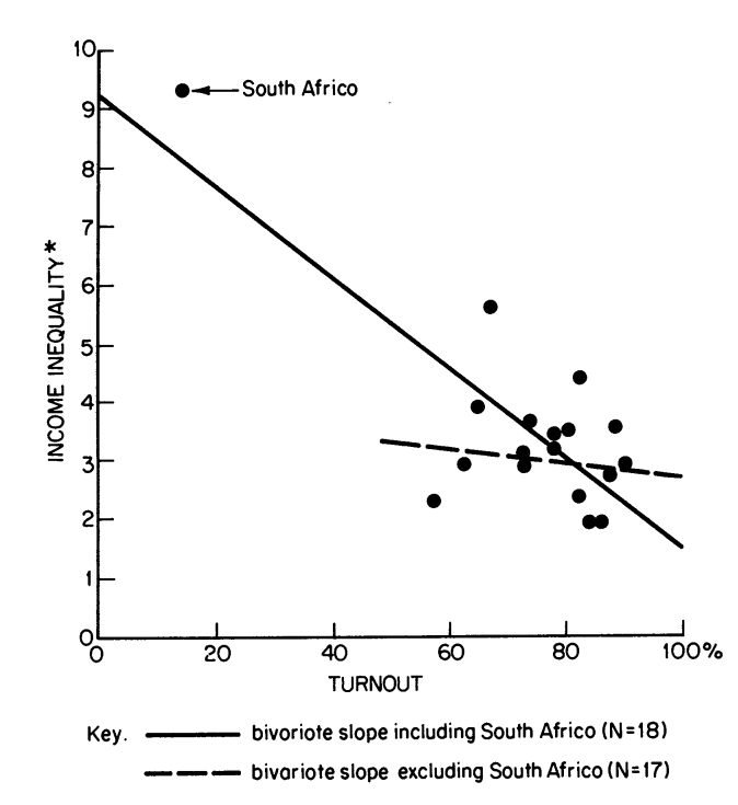
  • Table shows the results of a linear regression between income inequality and voter turnout, claiming to show a statistically significant negative correlation (Jackman 1980)

Outlier caused relationship
Graphs as Comparisons

Two purposes for graphs:

  1. Understand and communicate the size and direction of comparisons that were already of interest
  2. Discover new patterns

A graph is often all someone will remember about your data analysis, can make the difference between convincing important decision makers or not.

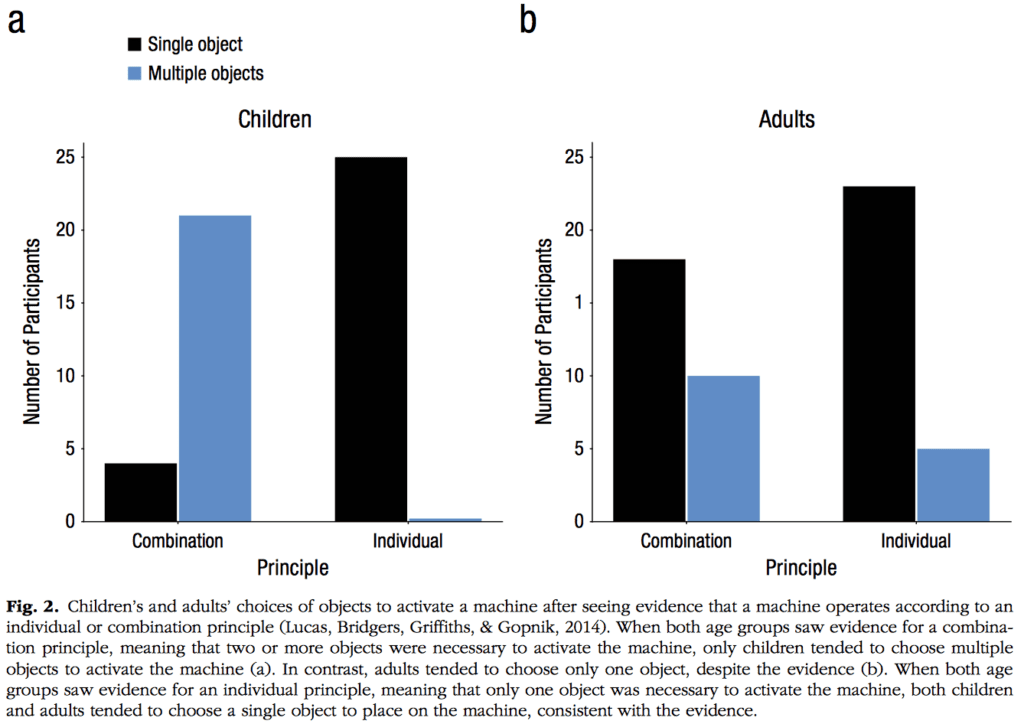
Improve this Graph

Reformulating the Data

  • Two Possible Stories
    • Children had higher accuracy than adults
    • Multiple objects is harder than an individual object
  • Caption suggests Adult vs. Child accuracy

Solution:

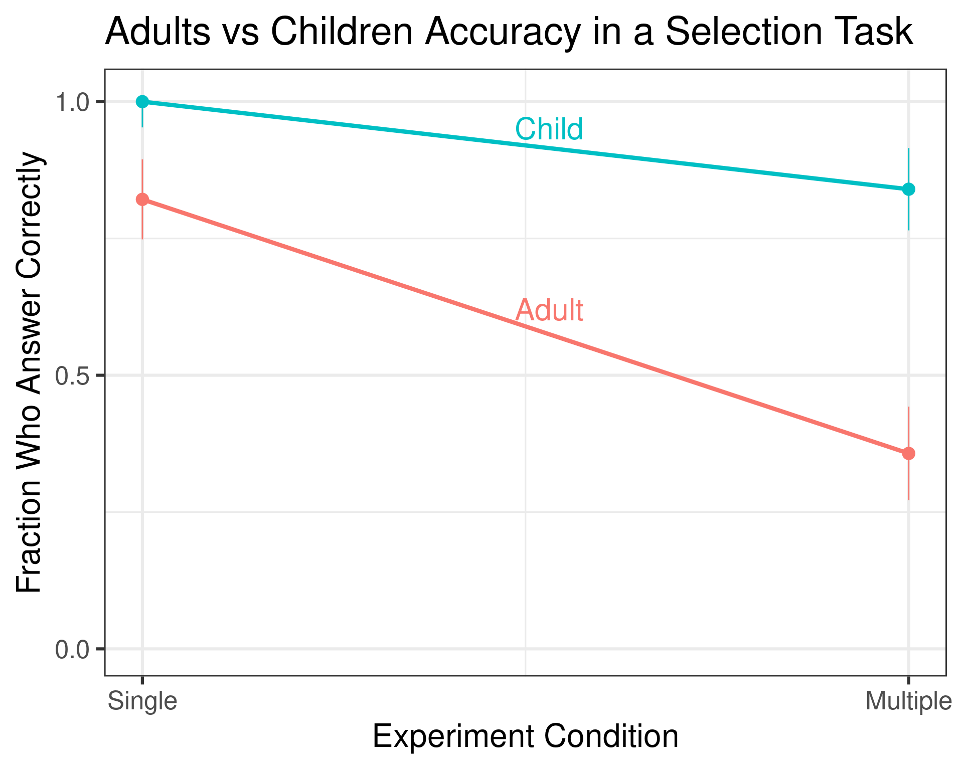
  1. Instead of plotting responses, plot accuracy
  2. Plot Accuracy of each group on the same axis

Case Study Solution: Line Plot

ggplot2 Basics

  • ggplot2 is tidyverse plotting package
  • Grammar of Graphics
  • Key figure components
    • data maps to aesthetics
    • interpreted using geoms
    • others: theme, facets, coordinates, stats
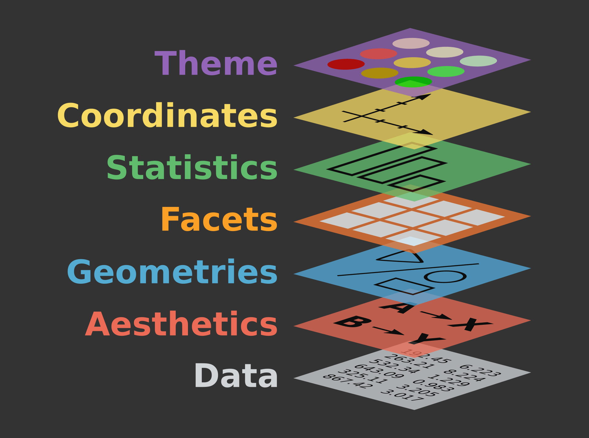
Source: DS-Box

Vignette: Transit Costs
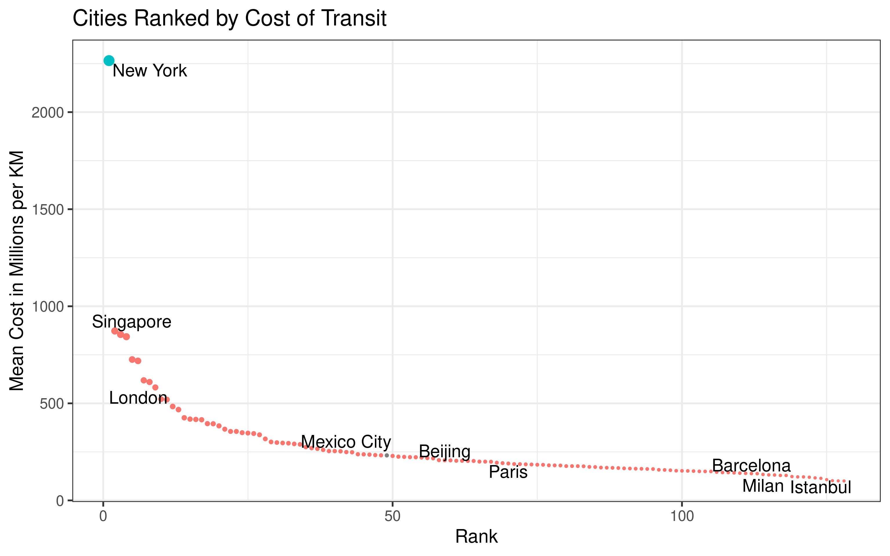
Source tidy tuesday Download Vignette Download Data

Categories of Graphs

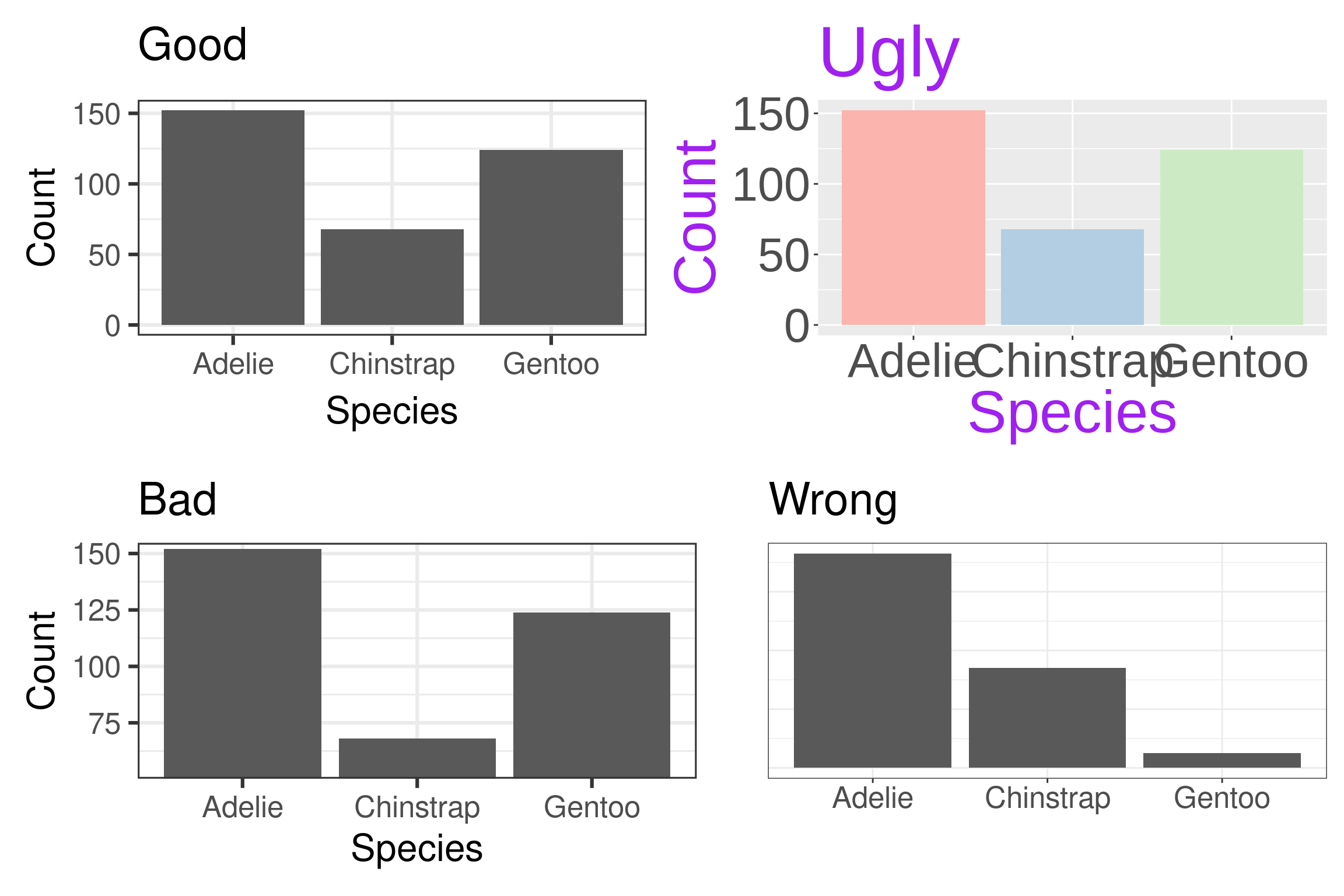
Avoiding Wrong

Wrong figures are missing information needed to decipher the meaning or contain mathematical errors

  • Label all axes and provide units if ambiguous
  • All axes need scales
  • Aestethic elements accurately represent the data
  • Legends and labels present when appropriate to identify meaning of other visual elements

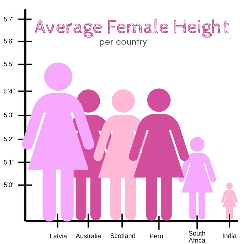
Ethics: Principal of Proportional Ink

“The representation of numbers, as physically measured on the surface of the graphic itself, should be directly proportional to the numerical quantities represented.” (1983, p.56) Edward Tufte, The Visual Display of Quantitative Information

  • This principle avoids many misleading visualizations

Example

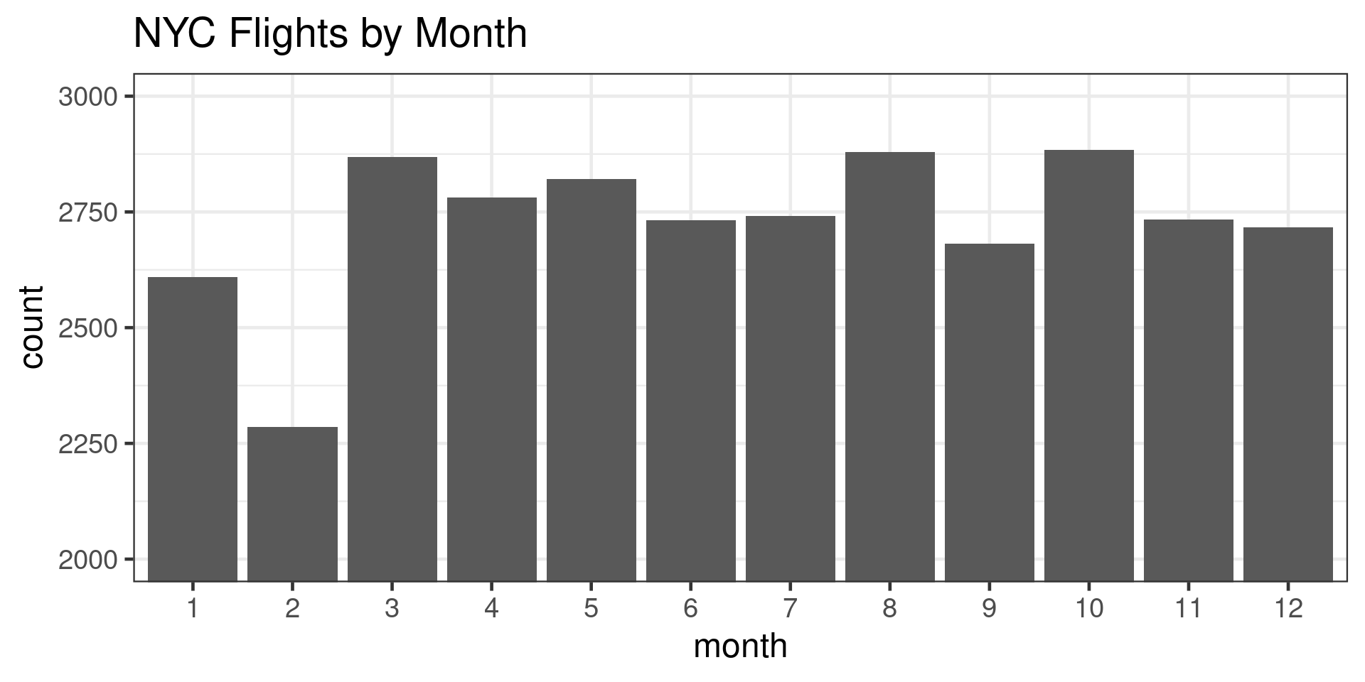
  • Scale doesn’t start at 0
  • Width expands with height
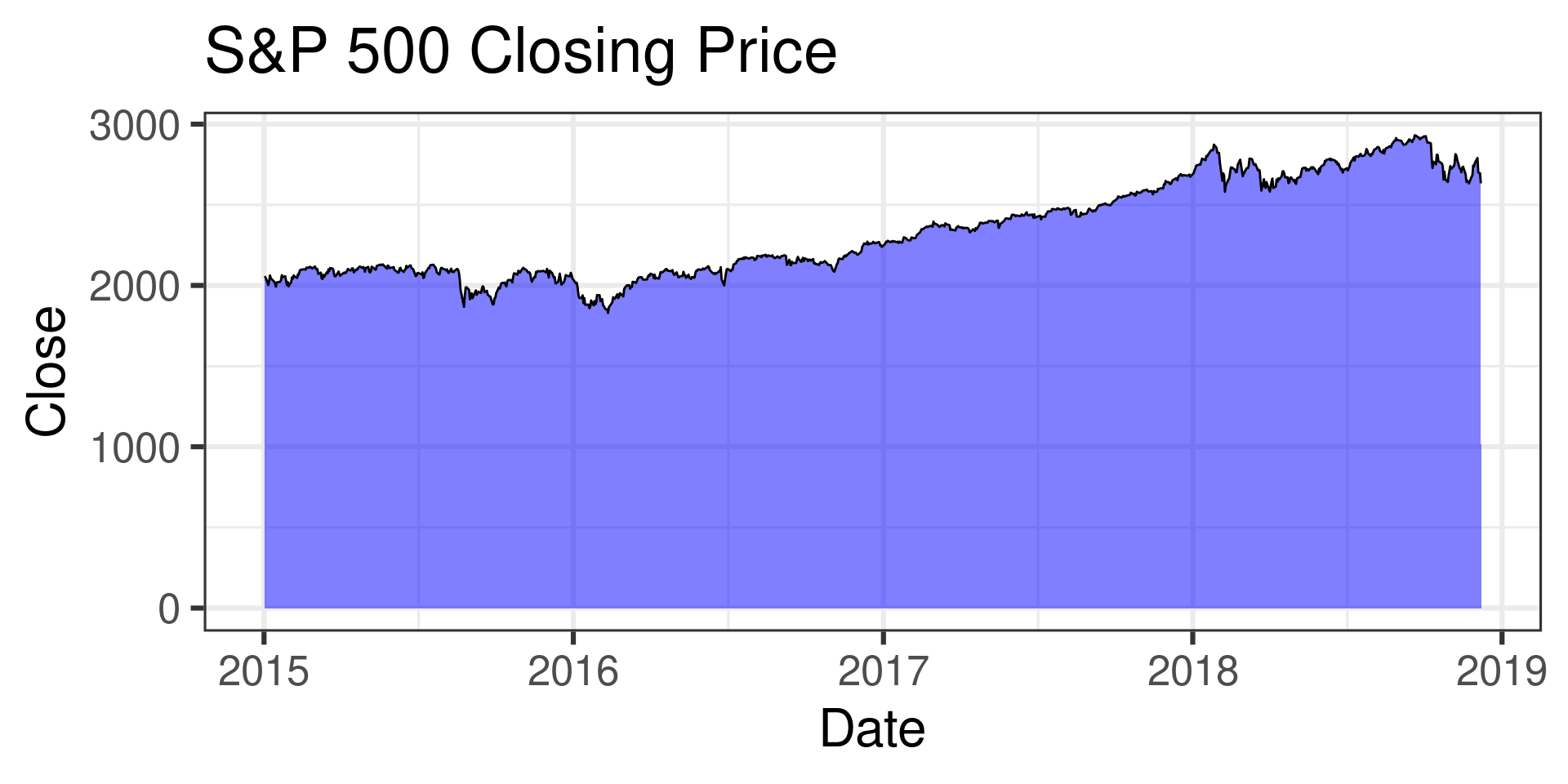
  • Danger in bar plots, filled line plots, plots with elements that scale with data

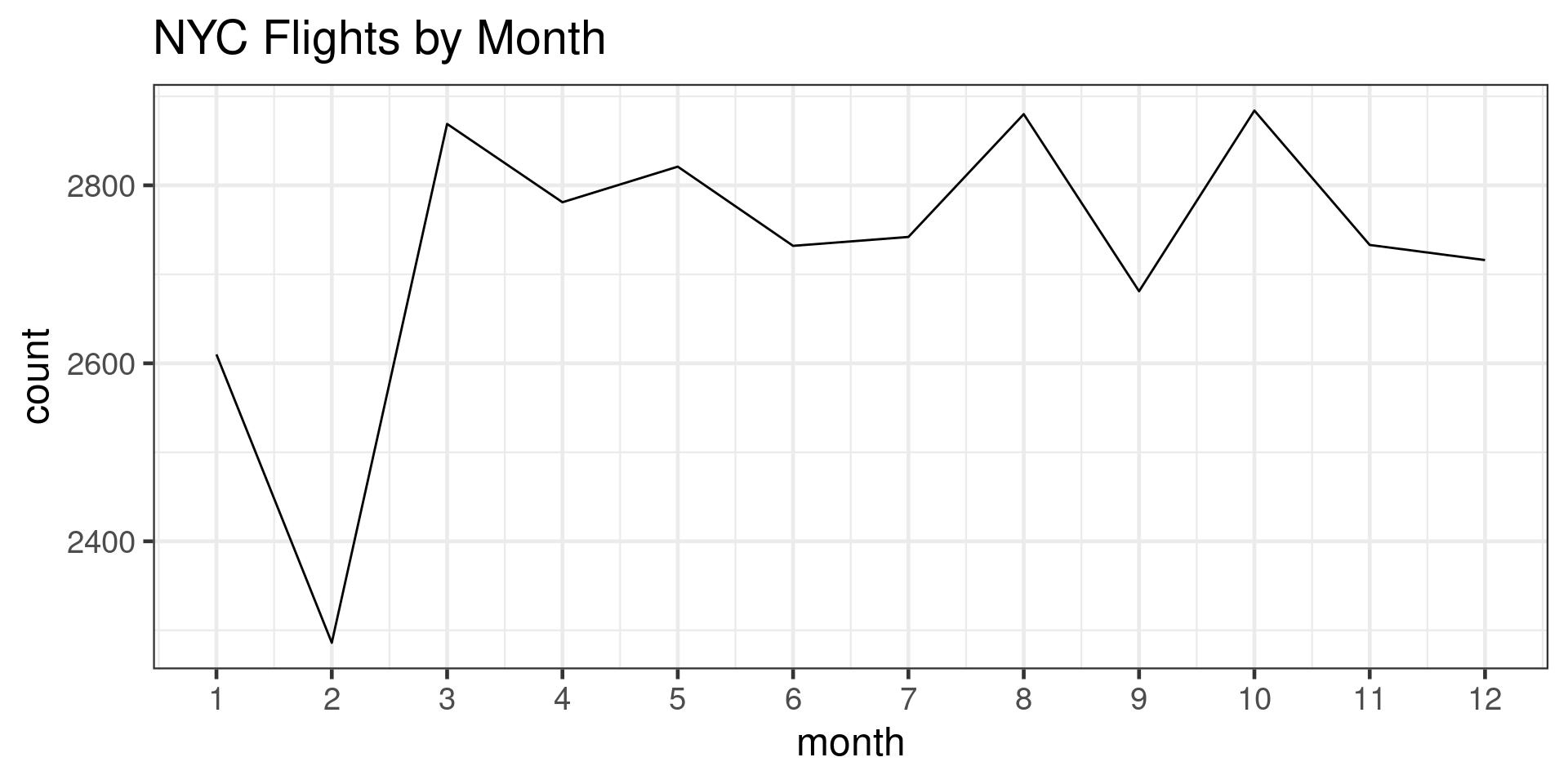
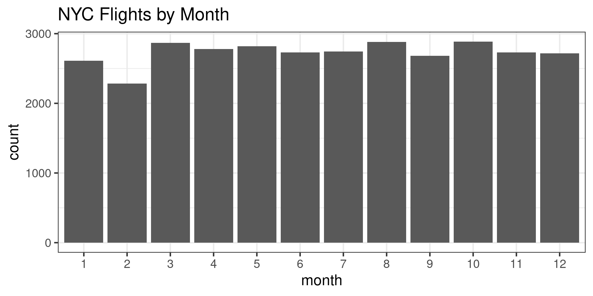
Bar Plots Should Start at 0

Wrong
Or make them line charts:

Right
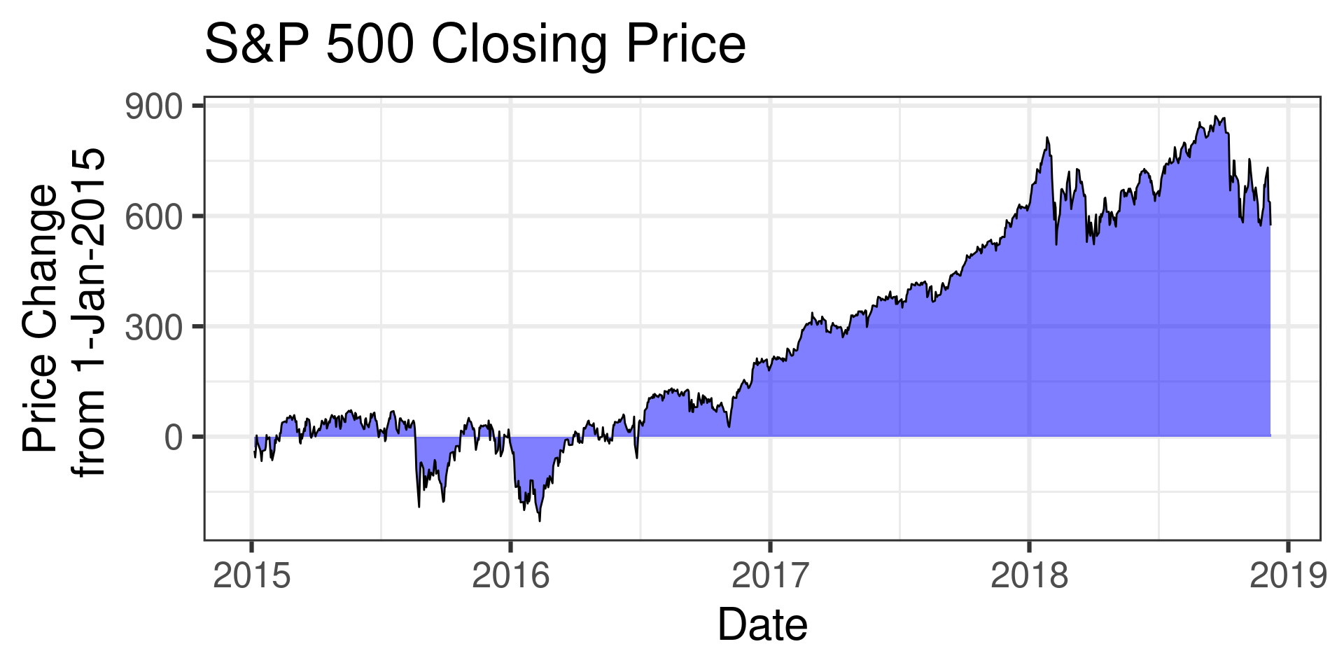
Filled Plots Should Start at 0

Wrong
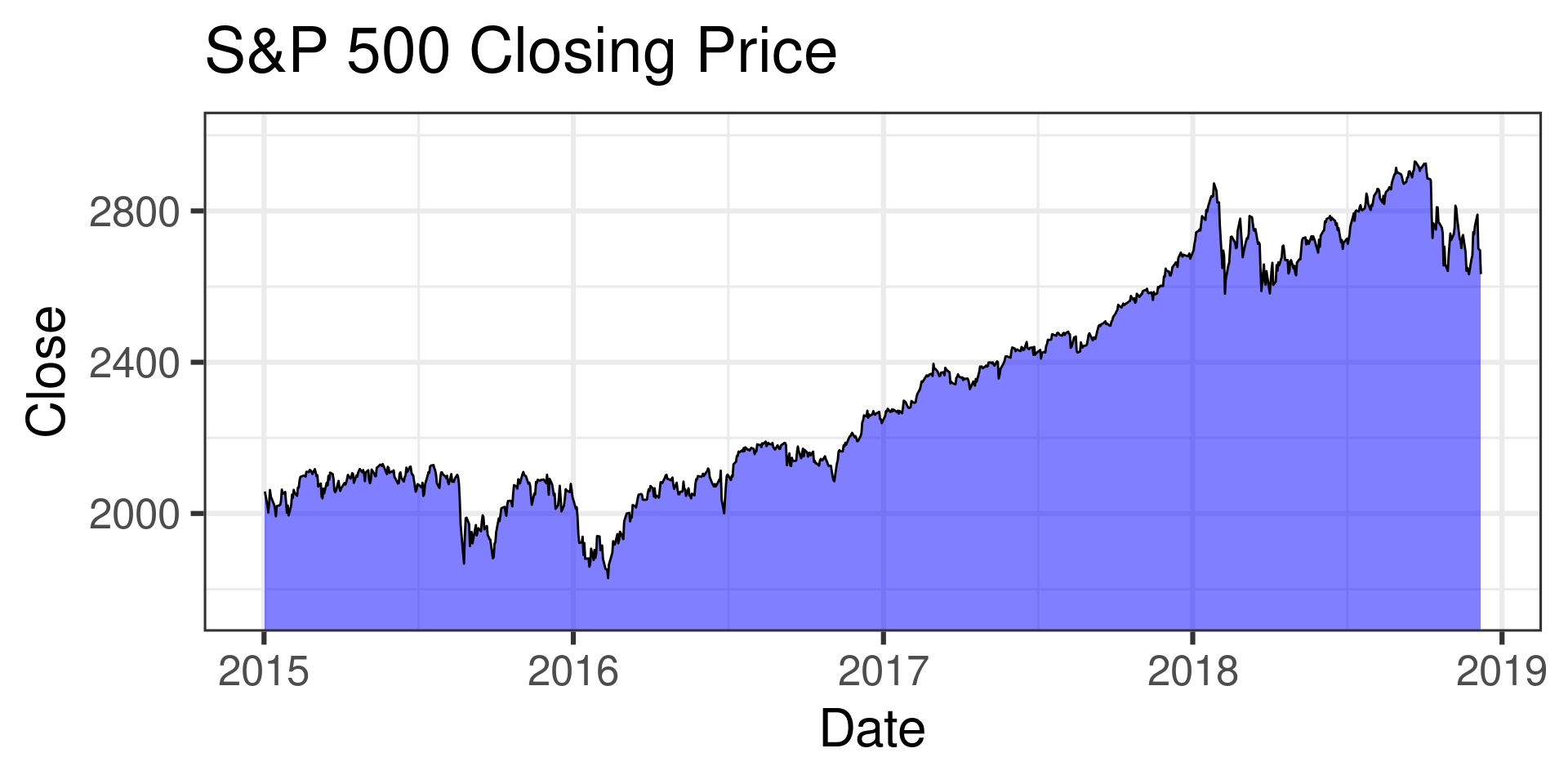
Or transform data to represent a net change:

Right
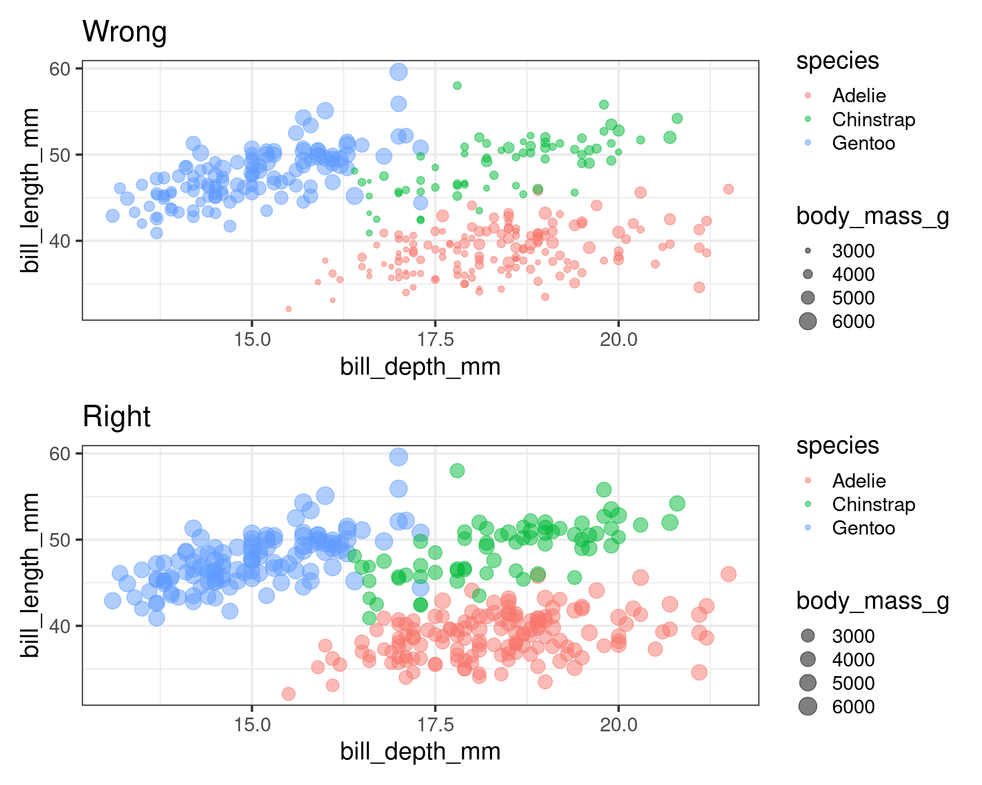
Scale Area not Radius
Meetup Reflection/One Minute Paper

Please fill out the following google form after the meeting or watching the video:

Click Here

Acknowledgements

  1. Active Statistics (Gelman, Hill, Vehtari)
  2. Principles of Data Visualization (Wilke)
  3. Calling BS (Bergstrom and West)
  4. Data Visualization (Healy)
  5. Impact of Outliers on Income Inequality (Jackman)