Meetup 4: Exploratory Data Analysis
2025-09-15
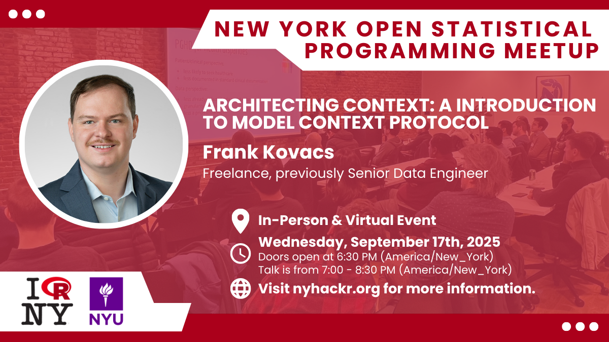
Meetup Wednesday!
![]()
- Join us this Wednesday Night at NYU
- nyhackr.org for tickets!
Week Overview
- EDA Lab due Sunday at midnight
- Posted coding demo on reprex/debugging
- Hadley Wickham EDA Demo
- Sign up for Data Science in Context!
- Today’s focus is EDA (Chapter 10)
- Vast subject, entire books on it
- Not from book: Inliers, QQ-Plots, Dot-Plots, Pair Plots
Case Study: Barley Yields in MN
- 10 Varieties of Barley
- Grown at 6 Different Sites
- Yield Measured in 1931 and 1932
- Data Used as an Exemplar in Stats Literature
Barley Data
| University Farm |
1931 |
Manchuria |
27.00000 |
| Waseca |
1931 |
Manchuria |
48.86667 |
| Morris |
1931 |
Manchuria |
27.43334 |
| Crookston |
1931 |
Manchuria |
39.93333 |
| Grand Rapids |
1931 |
Manchuria |
32.96667 |
| Duluth |
1931 |
Manchuria |
28.96667 |
| University Farm |
1931 |
Glabron |
43.06666 |
| Waseca |
1931 |
Glabron |
55.20000 |
| Morris |
1931 |
Glabron |
28.76667 |
| Crookston |
1931 |
Glabron |
38.13333 |
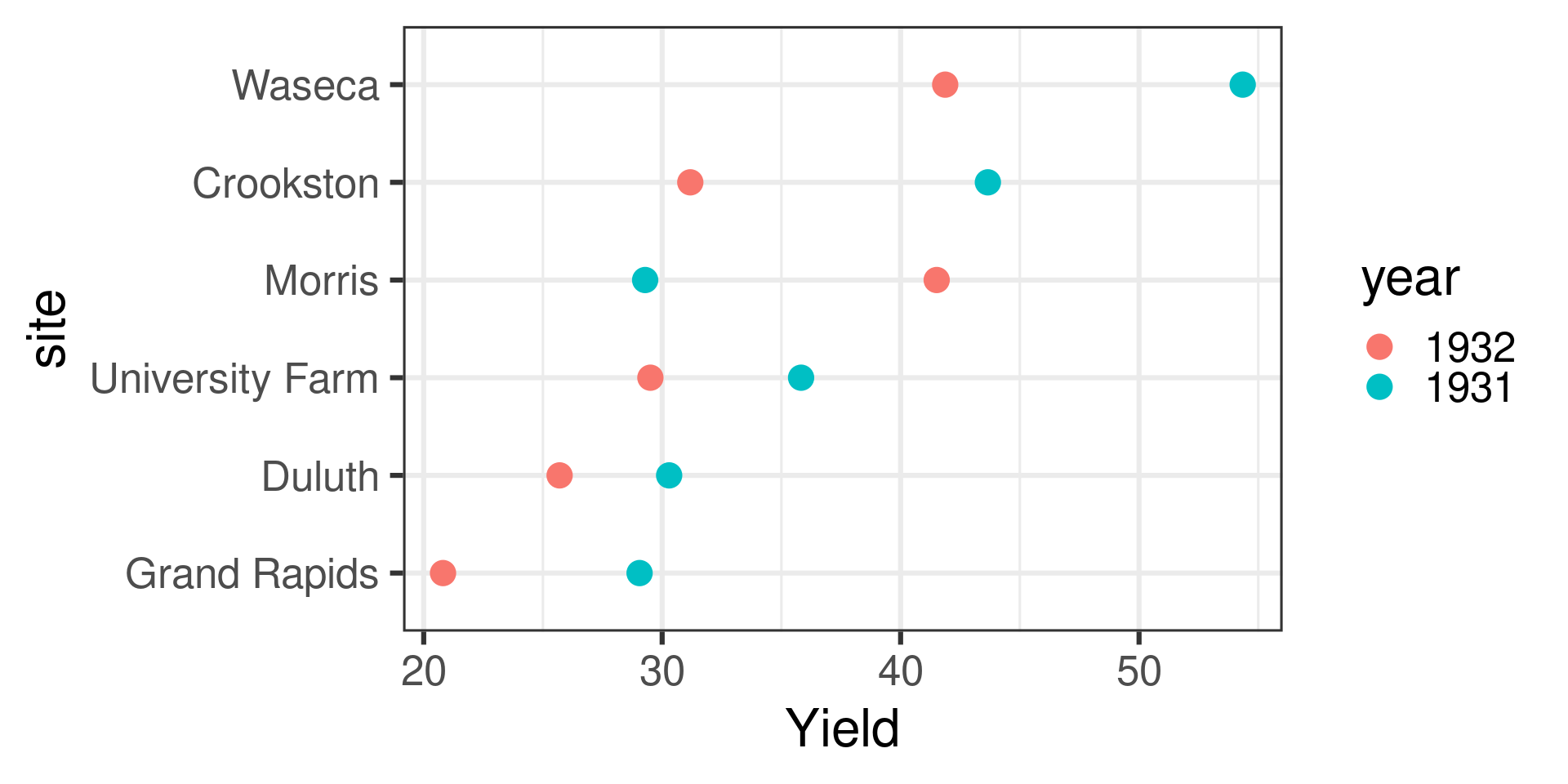
Visualize the Data
![]()
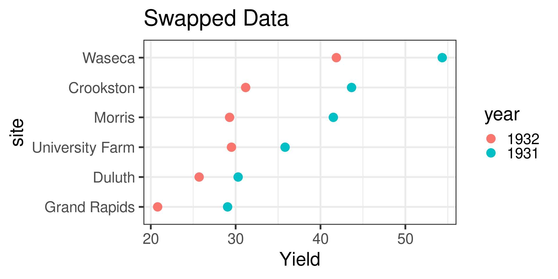
Swapped Years at Morris?
![]()
80 Years Later… an Investigation
![]()
Evidence Emerges
- Ambiguity in years of study noticed (1930 and 1931 versus 1931 and 1932)
- Swapping of a different sample discovered
- Statistical fits much more parsimonious on swapped data
- I would bet on data error, but we may never know without more experiments
What is Exploratory Data Analysis
Exploratory Data Analysis is the art of looking at data in a systematic way in order to understand the underlying structure of the data.
Two main goals:
- Ensure data quality
- Uncover patterns to guide future analysis
EDA is detective work- you ask and answer questions, which inspires more questions
EDA Steps
- General Characteristics of Data and Descriptive Stats (summary, skim, counts)
- Visualize Variation (Histograms, QQ Plots, Box plots, …)
- Deal with outliers, inliers, missing data
- Visualize relationships (bivariate and multivariate plots)
- Iterate
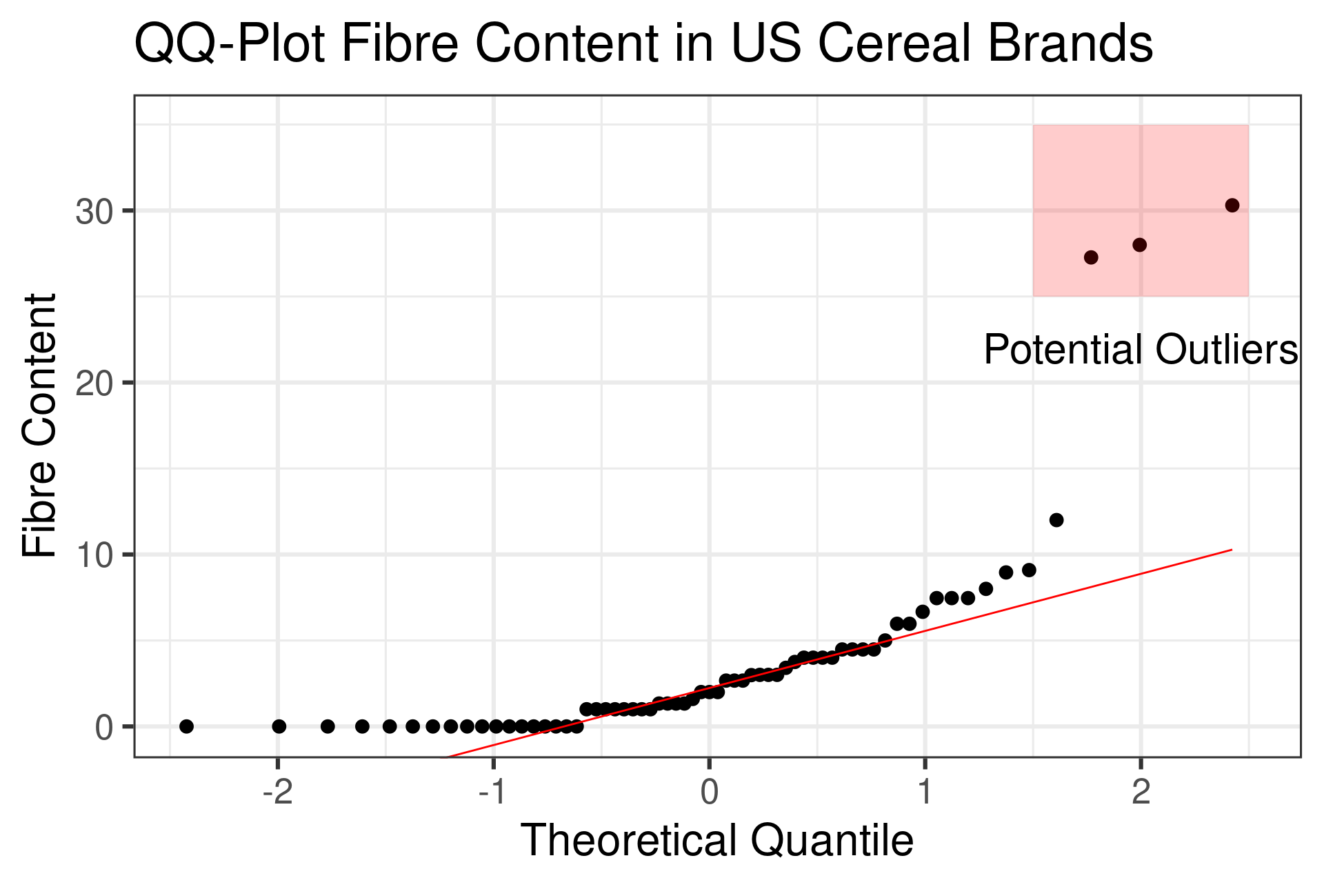
Quantile-Quantile (QQ) Plots
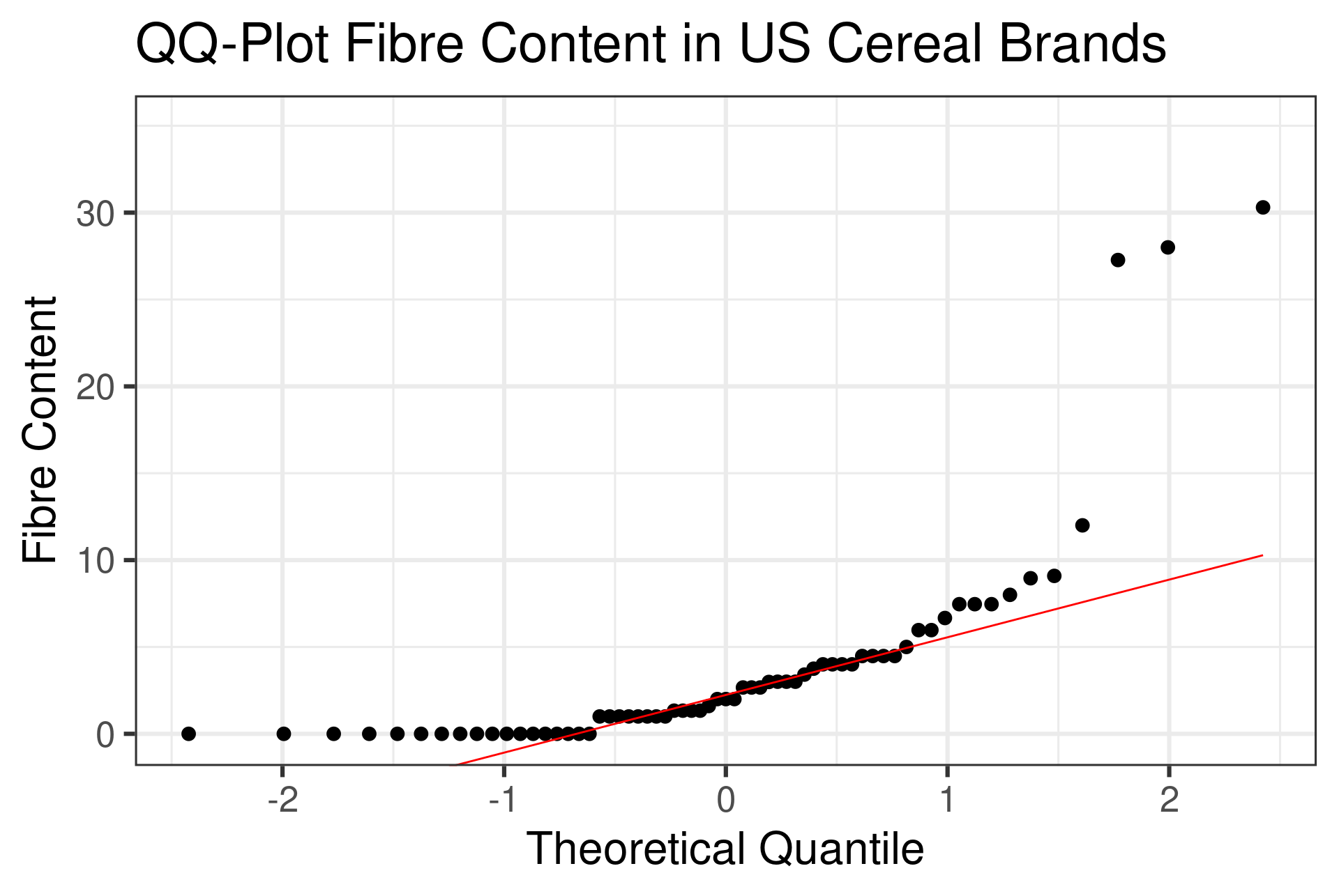
- Sorts data in increasing order, plots against sorted data from a probability distribution (usually Gaussian) or other dataset
- Most powerful/underused univariate visualization
- Create percentile vec
seq(0,1,1/(N+1))
- Drop ends and calculate data using
qnorm(seq)
- Scatterplot of Gaussian quantiles on x axis, your data on y
geom_qq, stat_qq do this for you
QQ Plot for US Cereals Data
![]()
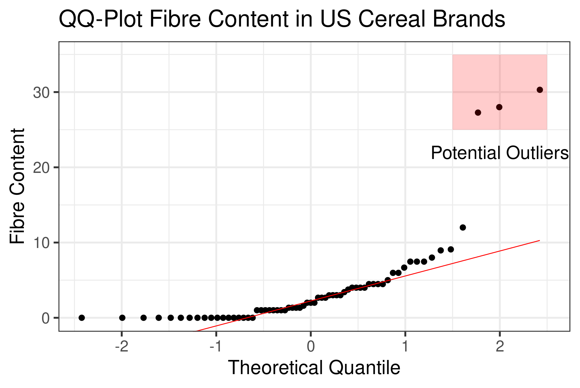
QQ Plot for US Cereals Data
![]()
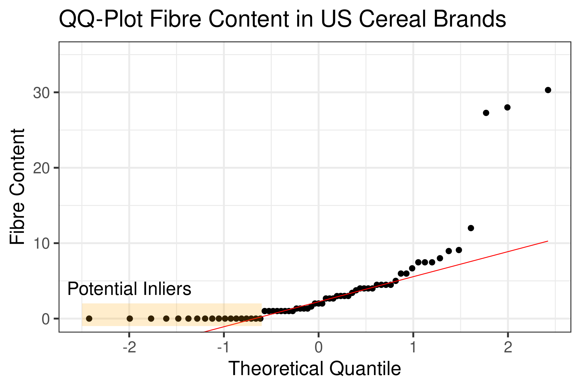
QQ Plot for US Cereals Data
![]()
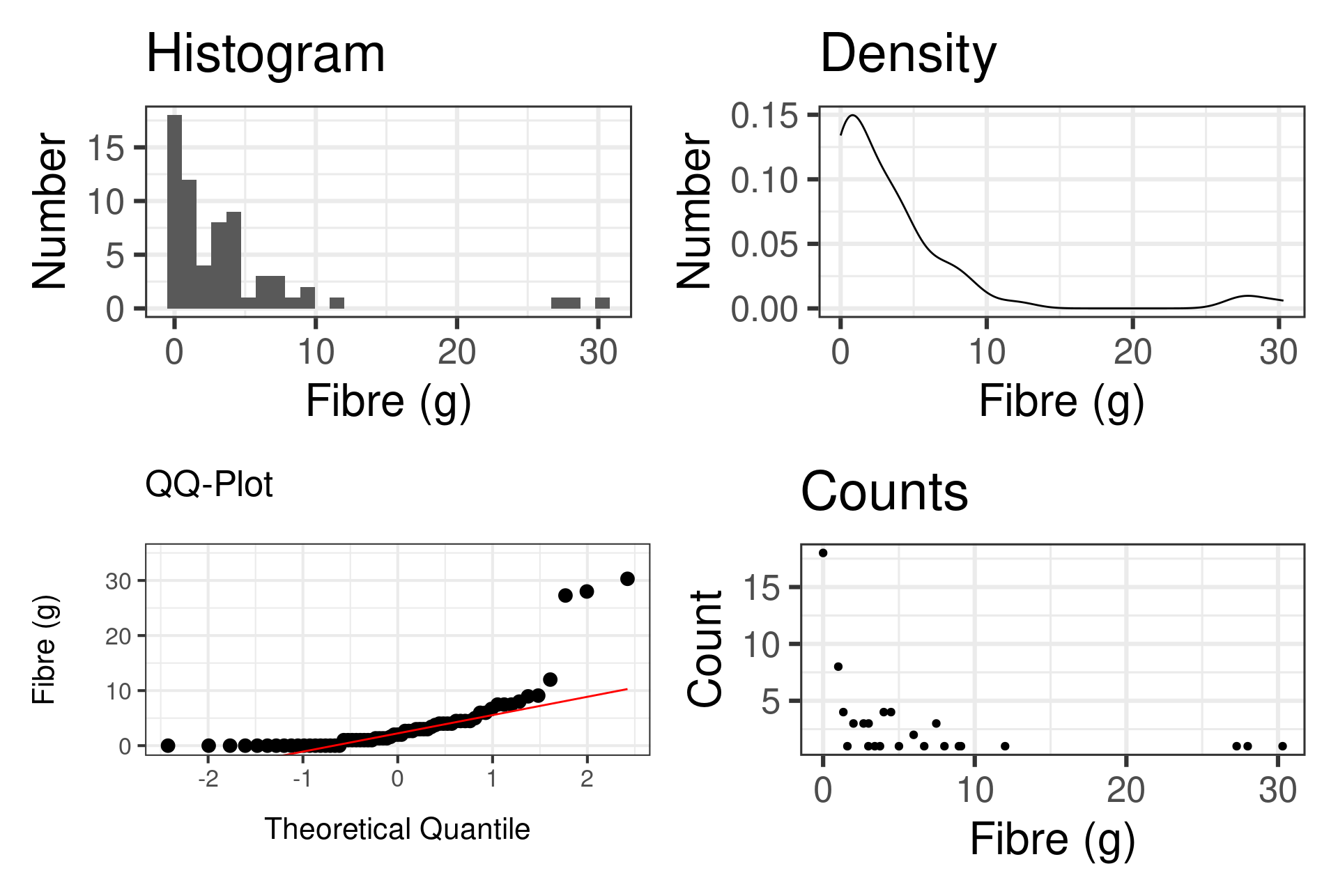
Comparing visualizations
![]()
Outliers
- Outlier is a data point you suspect was generated by a different mechanism than the rest of your dataset
![]()
What could outliers be?
- Could be a spurrious value
- Someone added an extra 0 to the spreadsheet value
- The measurement device was broken or miscalibrated
What could outliers be?
- Could be a major discovery
- Sign of a phenomenon you don’t understand yet
- Could be you just have a non-normal distribution
Never discard outliers without thinking and investigating them first!
Criteria for Outliers
- Heuristic for suspecting outliers:
\[ y > p_{75} + k \mathrm{IQR}\] Common to pick \(k=1.5\)
- Your domain specific expertise tells you what to do with outliers!
Inliers
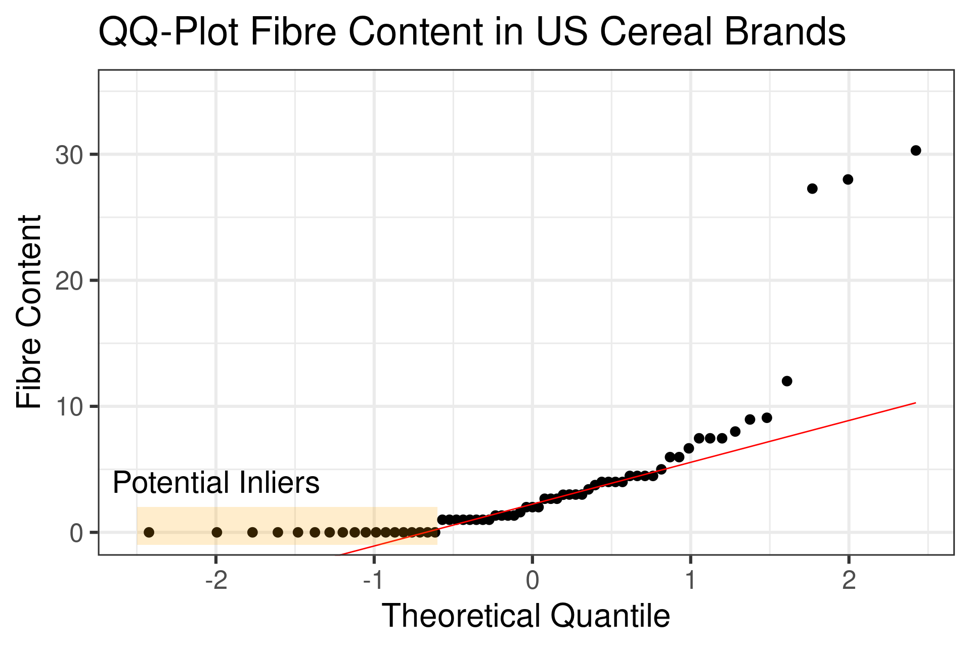
- Inliers: Value in the interior of the distribution of your data that is in error
![]()
Inliers
- Much more subtle and pernicious than outliers
- Often Disguised Missing Data
- NA values systematically coded as 0 or some other default
- Business or government transactions that require a some information for a form to be filled out that isn’t always available
- Common Manifestation in Repated Values
Check for Inliers
- Flat regions of your QQ-Plot
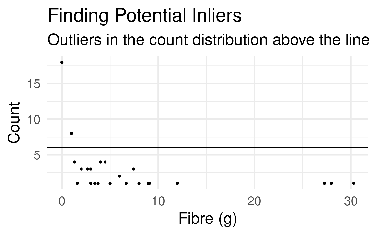
- Look for outliers of your count data:
UScereal |>
  group_by(fibre) |>
  summarise(count = n()) |>
  arrange(desc(count)) |>
  ggplot(aes(x=fibre,y=count)) +
  geom_point()
- Once you find them investigate
- Can also use boxplots, look at your data, or compute summary statistics
Check for Inliers
- Flat regions of your QQ-Plot
- Look for outliers of your count data:
![]()
Visualizing Covariation
- Covariation is how two variables vary together
- Numerical and Categorical
- Numerical variable has difference distribution for different values of the categorical variable
- Tools: Boxplots, violin plots
- Two Numerical Variables
- Scatterplots, 2D density plots such as hex-plots
- Pairs Plots
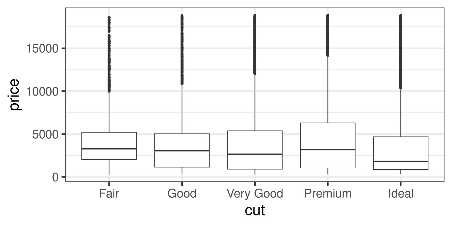
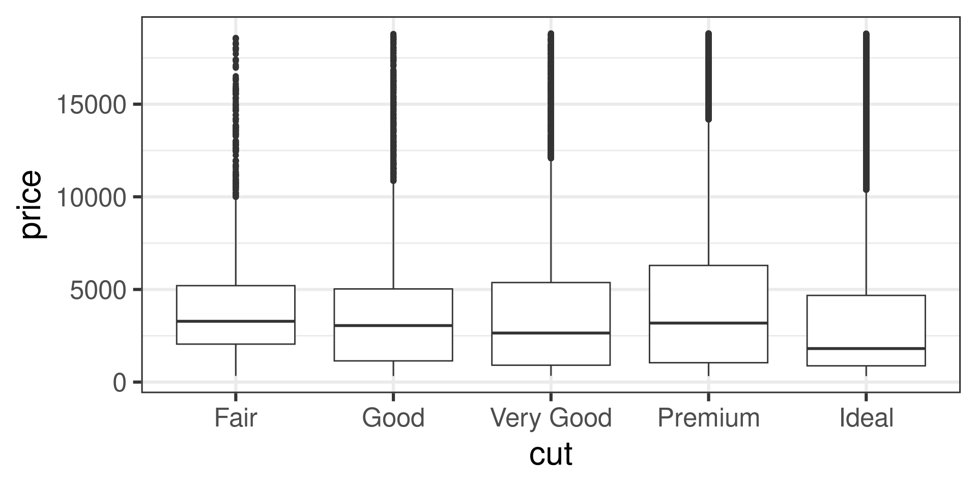
Tukey Box Plot
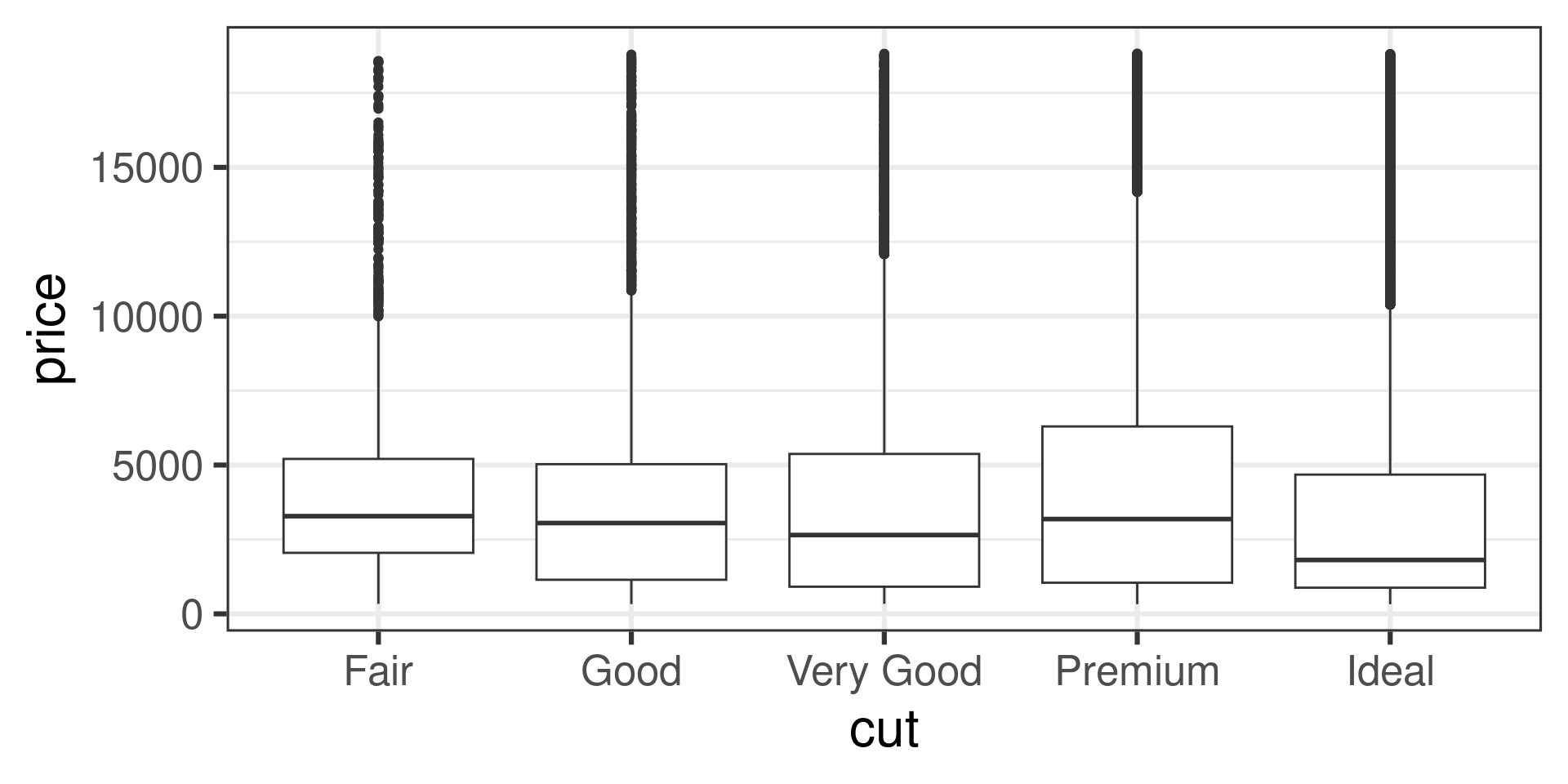
- The Tukey Box Plot is a robust visualization
- Median, IQR, potential outliers
![]()
Tukey Box Plot
- The Tukey Box Plot is a robust visualization
- Median, IQR, potential outliers
![]()
Tukey Box Plot
- The Tukey Box Plot is a robust visualization
- Median, IQR, potential outliers
- Code:
ggplot(diamonds, aes(x = cut, y = price)) +
  geom_boxplot() +
  theme_bw(base_size=24)
EDA Detective Work
- When you make a plot- ask questions
- Shouldn’t high quality cost more?
![]()
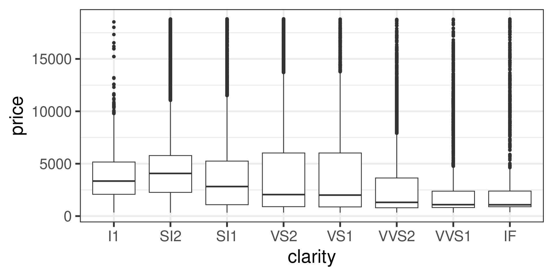
Look at other variables
- Clearer diamonds aren’t more expensive
![]()
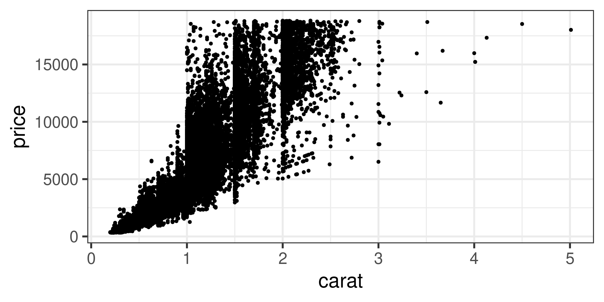
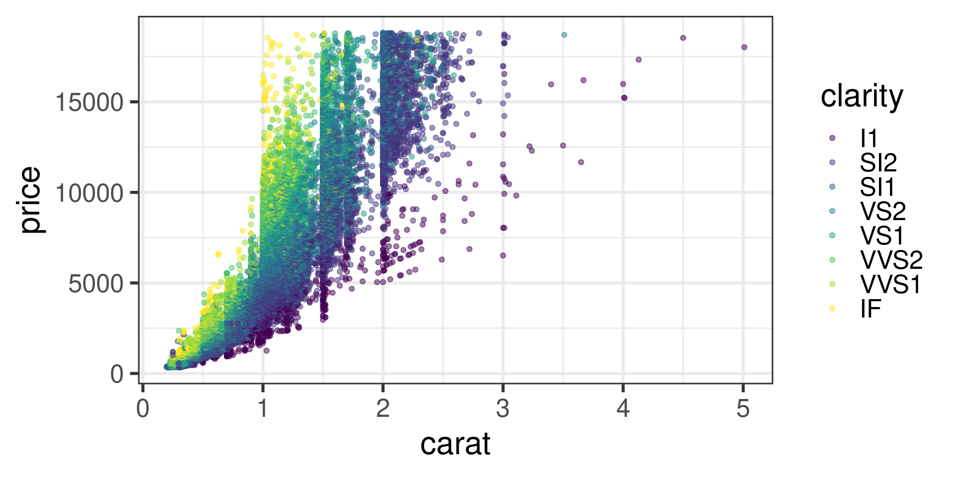
Look at other variables
- Bigger diamonds are very pricey
![]()
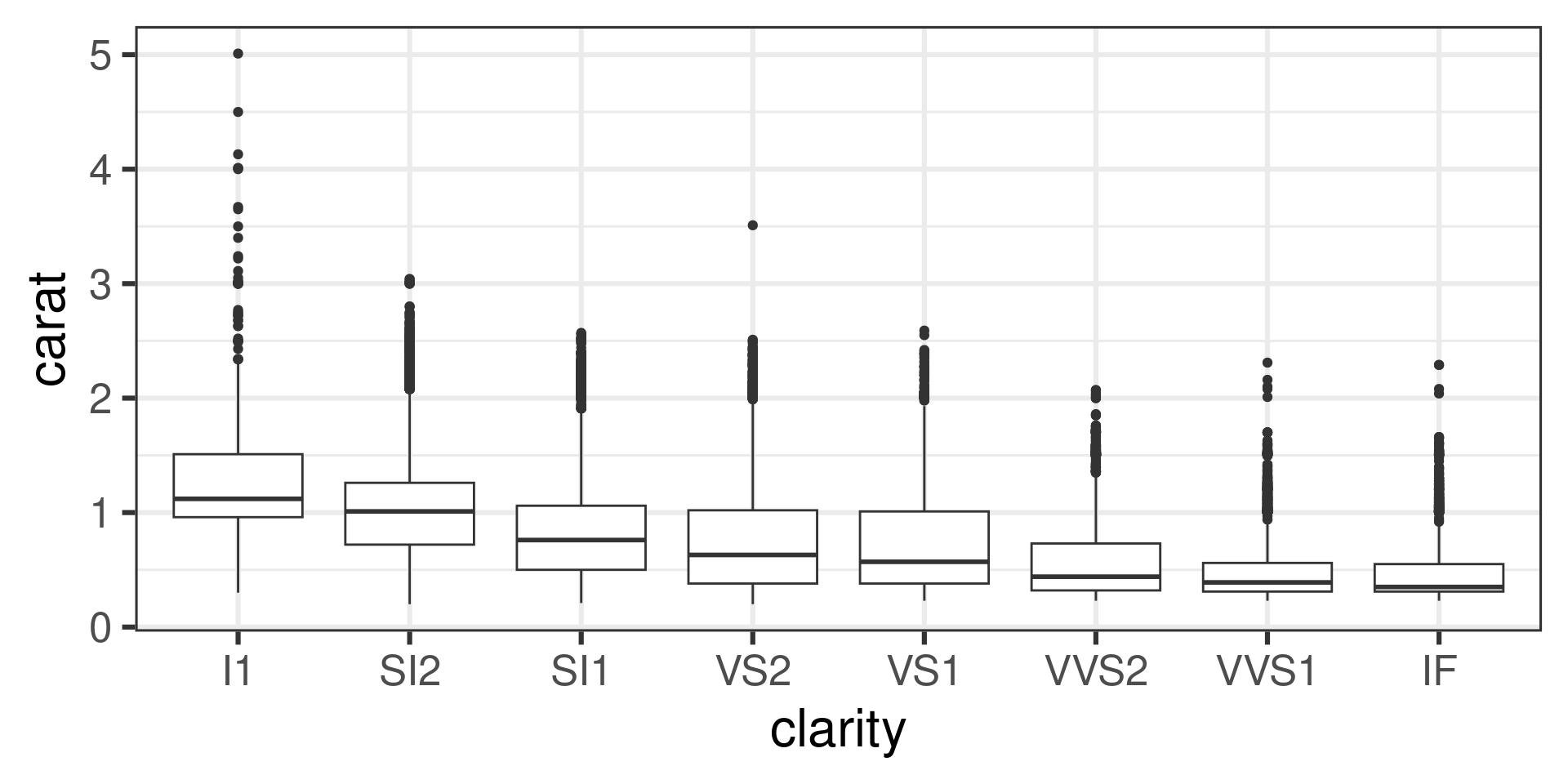
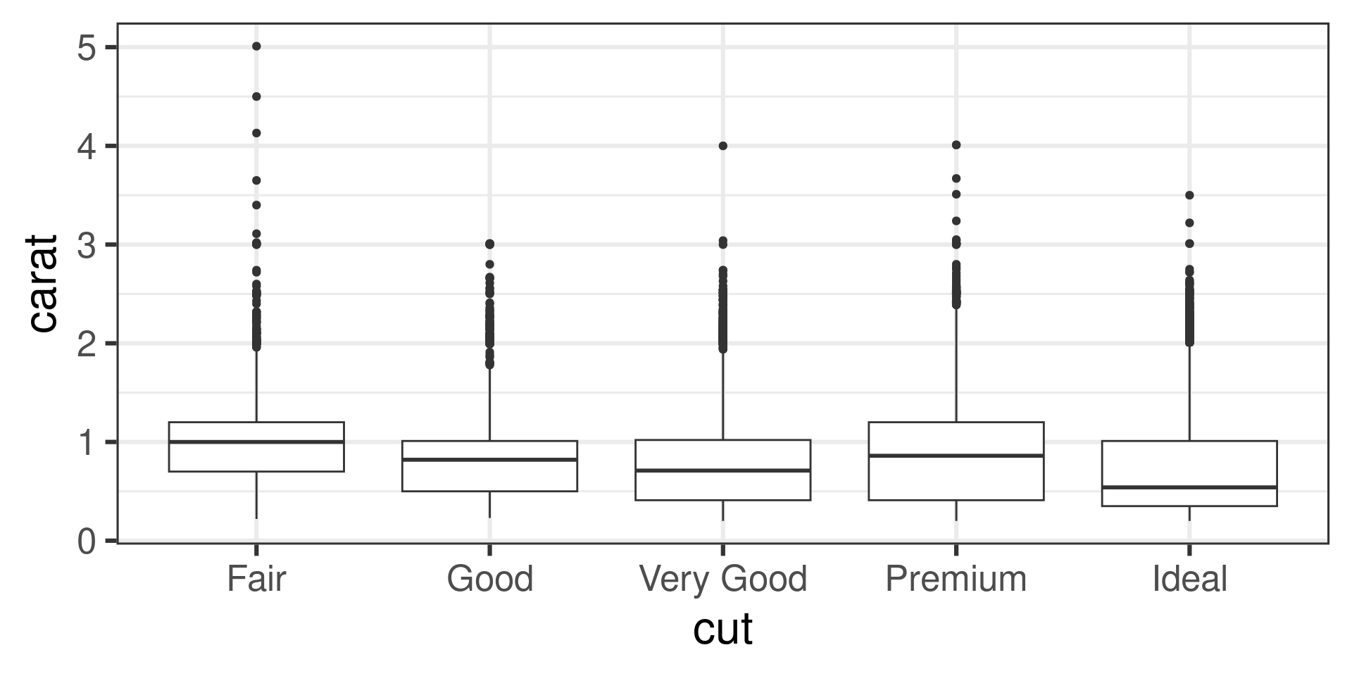
How does size covary with cut/clarity?
- Big diamonds have worse clarity
![]()
How does size covary with cut/clarity?
- Big diamonds have slightly worse clarity
![]()
Simpson’s Paradox
- For fixed size, quality leads to higher price
- Size is a common cause of price and quality
![]()
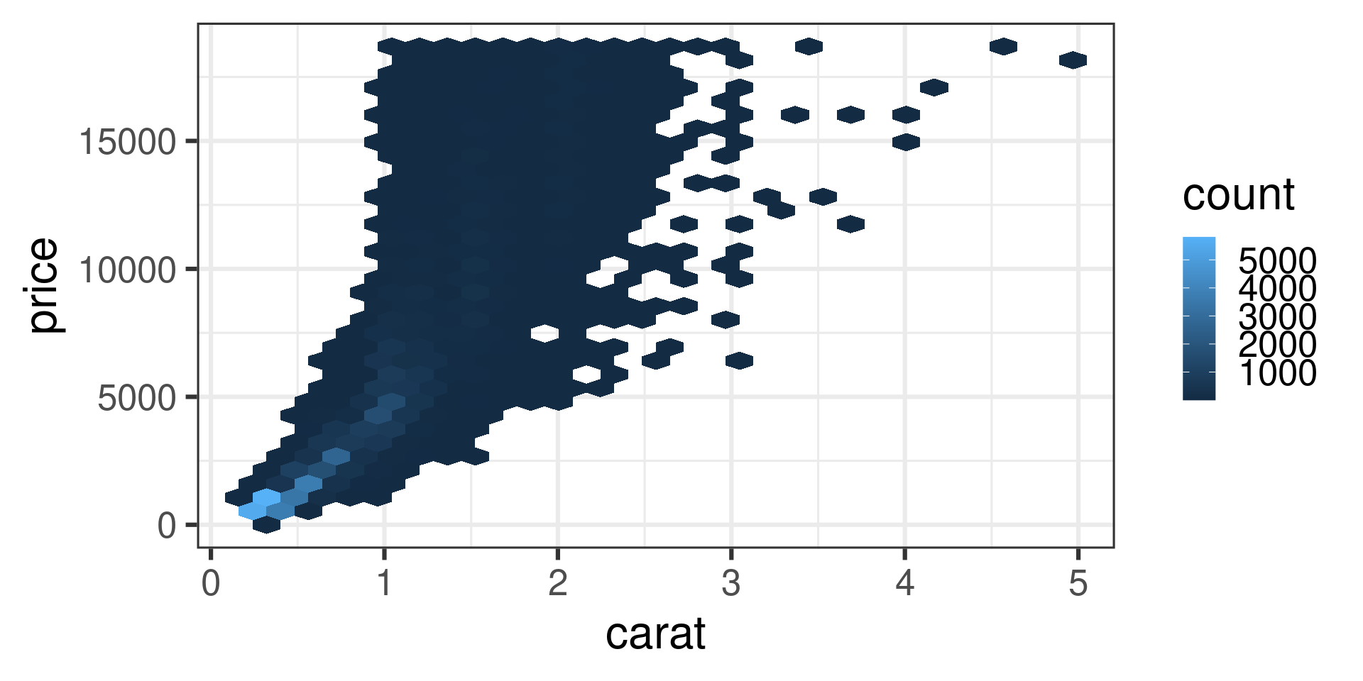
Density Plots
- When there are lots of points, density plots are better than scatter plots
![]()
Density Plots
- When there are lots of points, density plots are better than scatter plots
ggplot(diamonds, aes(x = carat, y = price)) +
  geom_hex() +
  theme_bw(base_size=24)
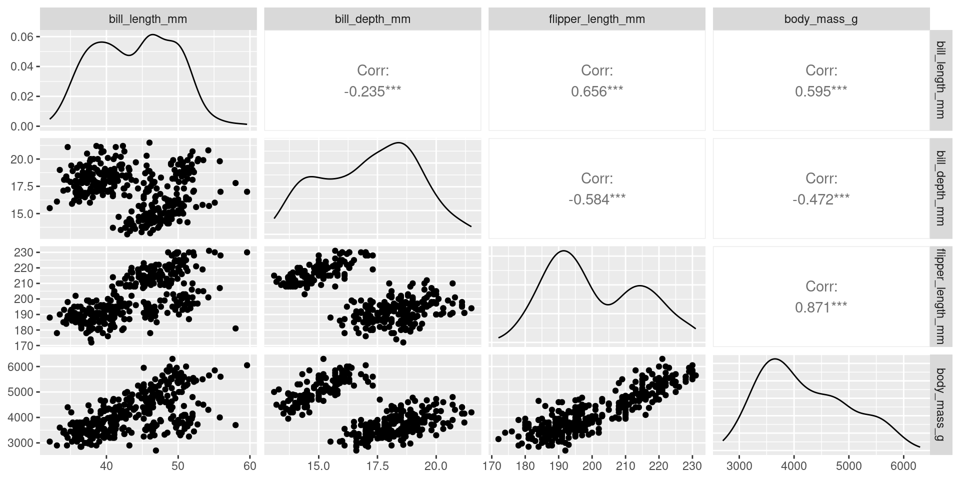
Pair Plots to Visualize All Combos
GGally package ggpairs function
![]()
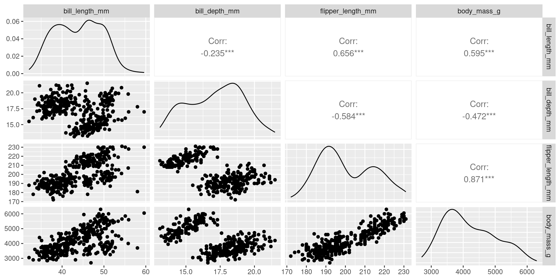
Pair Plots to Visualize All Combos
penguins |> ggpairs(columns=3:6)
![]()
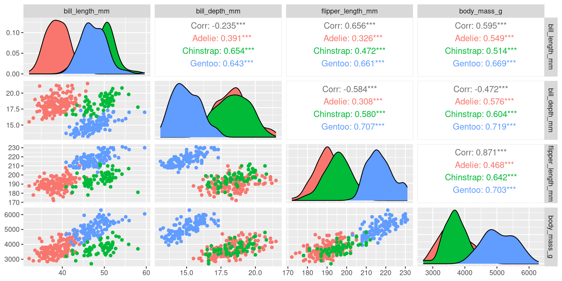
Fancy Pairs
penguins |> ggpairs(columns=3:6,ggplot2::aes(colour = species))
![]()
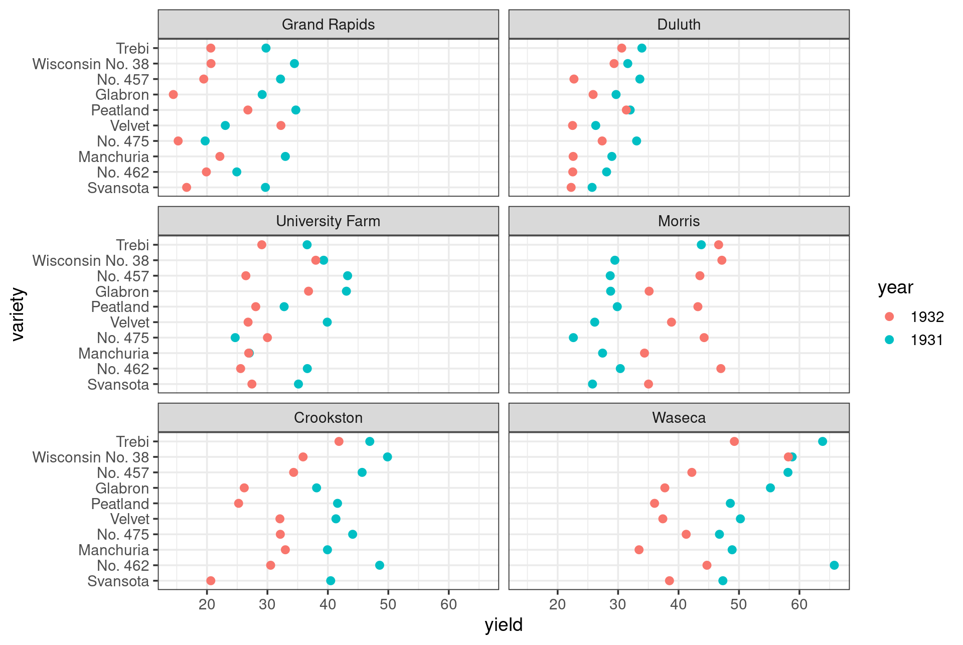
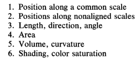
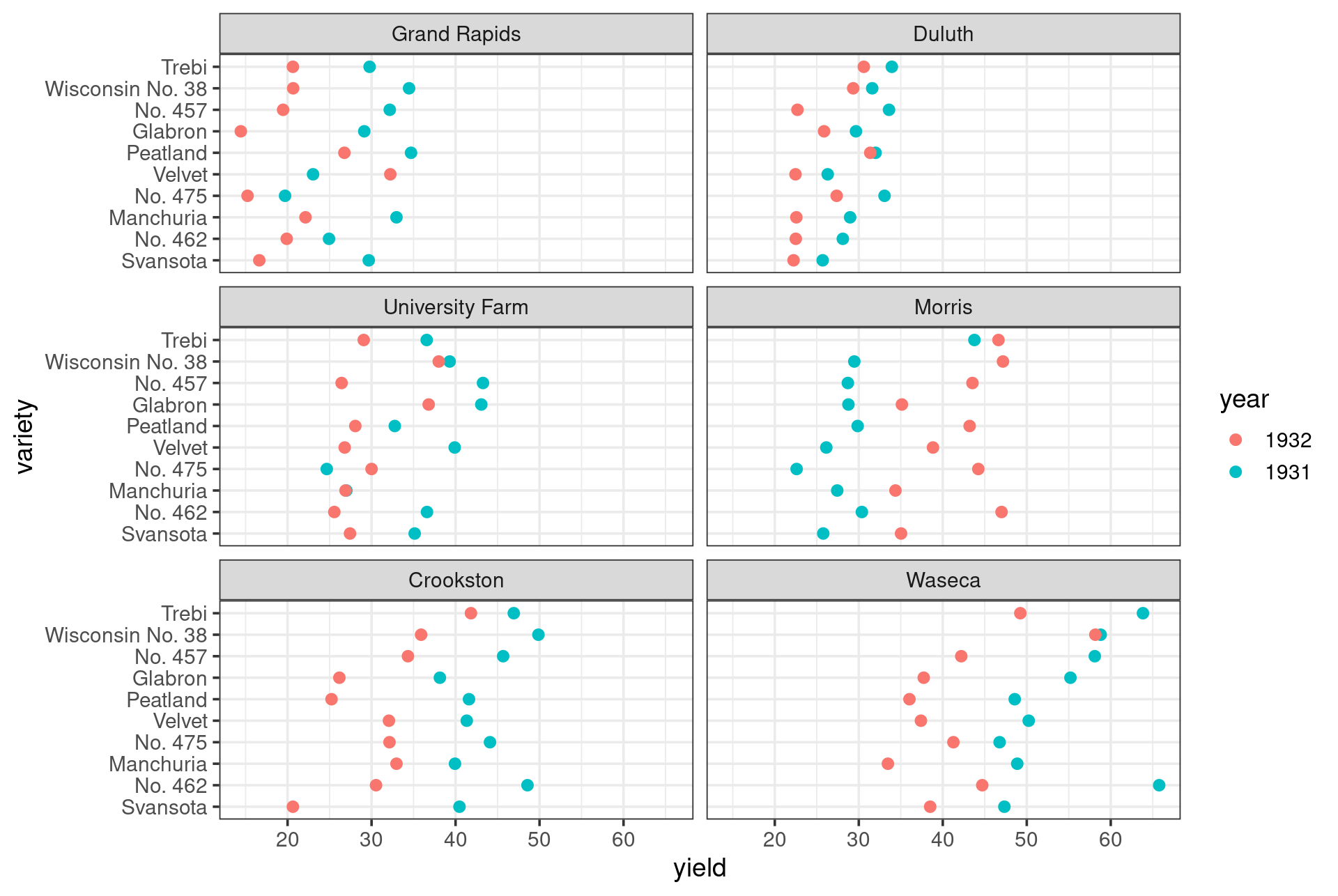
Multiway Visualizations: Dot Plots
![]()
- Dot-Chart created to emphasize position comparisons
Dot Plots
![]()
Dot Plots
barley |>
  ggplot(aes(x=yield,y=variety,color=year)) +
  geom_point(size=2) +
  facet_wrap(~site,nrow = 3) +
  theme_bw(base_size = 10)
What Didn’t We Talk About
- Simple Models are used a lot in EDA
- See example in Chapter 10
- Residuals remove the effect of a major variable and see what remains
- Transformations
- We will discuss transformations more next week
- Reexpress data in new way
- Most important by far is
log transform
Meetup Reflection/One Minute Paper
Please fill out the following google form after the meeting or watching the video:
Click Here